
Design an email with the editor
The email editor lets you build an email by stacking blocks: titles, texts, buttons, images, columns. The result adapts to computers and phones and displays properly in the main mailboxes.
Where to find the editor
Section titled “Where to find the editor”The same editor is used in three places:
- Email campaign: in the content window, under Email design, click Create your design or Edit your design (see Create and send a campaign).
- Automation: in an email’s content, choose the Email Builder mode, then Create your design (see Schedule automatic messages).
- Invitation: see Customize the invitation email.
Get to know the screen
Section titled “Get to know the screen”The editor opens full screen, with its title at the top left, for example Design your email.
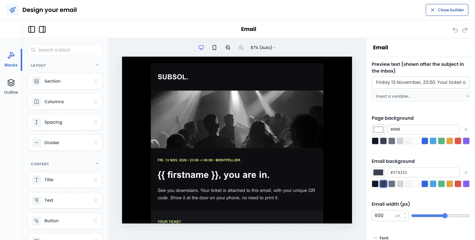
- On the left, the available blocks, grouped in three families. The Search a block field filters them by name.
- In the middle, your email as it will be received. The icons above it switch between computer width and mobile width.
- On the right, the settings of the selected block. When no block is selected, these are the settings of the whole email.
- At the top right, Close builder takes you back to the form.
A new email does not start from a blank page: it already contains a section with a Hello! title, a sample text and a Discover button. Edit them or delete them.
Build the email
Section titled “Build the email”-
Drag a block from the left column onto the email, where you want it.
-
Click the block to select it and adjust it in the right column.
-
To move a block, drag it somewhere else. To duplicate or delete it, use the actions that appear when it is selected.
-
When the email looks right, click Close builder.
-
Back in the form, check the Preview, then save: Save content for a campaign, Save for an automation.
Available blocks
Section titled “Available blocks”Layout
| Block | What it is for | Settings |
|---|---|---|
| Section | A container that groups other blocks, with a shared background. | Background color, vertical and horizontal spacing. |
| Columns | Place blocks side by side, from 1 to 4 columns. | Number of columns, Space between columns (px), Vertical alignment (Top, Middle, Bottom), On mobile (Stack the columns or Keep them side by side), Background color, spacing. |
| Spacing | Empty space between two blocks. | Height (px), from 4 to 160. |
| Divider | A horizontal line. | Line color, Thickness (px) from 1 to 12, spacing. |
Content
| Block | What it is for | Settings |
|---|---|---|
| Title | A one-line heading. | Text, Level (Title 1, Title 2, Title 3), Text size (px), Alignment, Text color, spacing. |
| Text | A formatted paragraph: bold, italic, lists, links. | Content, Text size (px), Line height, Alignment, Text color, spacing. |
| Button | A clickable button, for example to your ticketing page. | Label, Link, Button color, Text color, Text size (px), Rounded corners (px), Alignment, Width (Fit the text or Full width), spacing. |
| Image | A photo, a poster, a logo. | See Add an image. |
| Add to wallet buttons | The ticket’s Apple Wallet and Google Wallet buttons. | Button language (French or English), Alignment, spacing. This block only appears in the invitation email (see Wallet cards). |
Advanced
| Block | What it is for | Settings |
|---|---|---|
| Custom code | Insert your own HTML code. | HTML code. |
Set up the whole email
Section titled “Set up the whole email”Click beside the email, on the background, so that no block is selected. The right column then shows the Email settings:
- Preview text (shown after the subject in the inbox): the sentence that goes with the subject in the message list. Put useful information in it, for example the event date.
- Page background: the colour around the email. Light grey by default.
- Email background: the colour of the content area. White by default.
- Email width (px): from 320 to 800 pixels, 600 by default.
- Font: Arial, Helvetica, Verdana, Tahoma, Trebuchet MS, Georgia, Times New Roman or Courier New. These are common fonts, available on most devices.
- Text color and Link color: the default colours of all blocks.
Colours are typed as a hexadecimal code (#1F2937) or picked from the palette. An empty field shows Inherited: the block then uses the colour set for the whole email.
Add an image
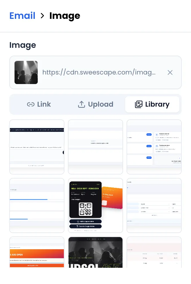
Section titled “Add an image”The Image setting of the image block offers three tabs:
- Link: paste the address of an image that is already online.
- Upload: drop an image from your computer, then click Upload this image. PNG, JPG or GIF formats, 5 MB maximum. WEBP is not accepted in emails, because some mailboxes do not display it.
- Library: find the images already uploaded for your emails and reuse them in one click.
The other image settings:
- Alternative text (shown when images are blocked): describe the image, for example “SUBSOL #15 poster”. Many mailboxes block images by default.
- Link (optional): the address opened when the image is clicked.
- Width: Custom width, with a Maximum width (px), or Full width.
- Display: Whole image, or Crop to a height with a Crop height (px) and a Focal point that chooses which part of the image to keep. Not every mailbox applies the crop: some show the whole image, never distorted.
- Rounded corners (px), Alignment and spacing.
Personalize the text
Section titled “Personalize the text”You can insert variables, such as the recipient’s first name, that are replaced when sending:
- in a Text block, with the
{ }menu of the text toolbar; - in a title’s Text, a button’s Label and Link, an image’s Link (optional) and the Preview text, with the Insert a variable… list below the field.
The variables offered depend on where you are: the audience’s columns for a campaign, the attendees’ information for an automation. See Personalize with variables.
Display on mobile
Section titled “Display on mobile”On a screen 600 pixels wide or less, the email takes the full width. Columns blocks set to Stack the columns move one below the other. Use the mobile icon above the preview to check the result.
Preview and test
Section titled “Preview and test”- In the editor, the email appears as it will be sent, without the unsubscribe notice Sweescape adds to campaigns.
- In the form, the Preview shows the full email after you close the editor.
- For a campaign, send yourself a test with Test this campaign (see Send a test). Automations have no test send.
Reuse an existing email
Section titled “Reuse an existing email”- An automation email written in Simple Email Message mode opens in the editor as a Text block containing your message.
- An email designed with the former Sweescape editor that could not be converted into blocks opens as a single Custom code block. You can keep it as is, or rebuild it with blocks and then delete the Custom code block.