
Get started with the page editor
The page editor lets you build your ticketing page by dragging and dropping blocks. What you see in the editor is what your buyers will see.
Open the editor
Section titled “Open the editor”-
Open your event, then the Ticket tab.
-
In the Page Configuration card, click Open Page Builder.
-
The editor opens full screen, under the title Create your page. To leave it, click Close builder at the top right.
The Esc key and clicking outside the editor do not close it: this prevents leaving it by mistake.
The editor screen
Section titled “The editor screen”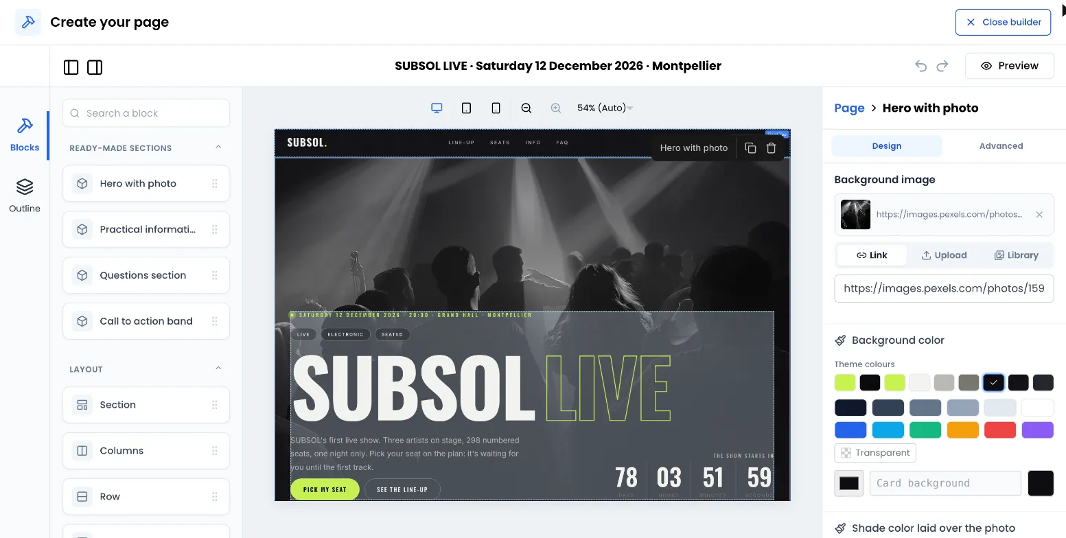
- On the left, two tabs: Blocks (the list of blocks, sorted by category, with a Search a block field) and Outline (the page outline: every block in order, including those placed inside other blocks).
- In the centre, your page, as it will be displayed.
- On the right, the settings of the selected block. When no block is selected, this panel is titled Page and shows the settings of the whole page. See Colours, fonts and SEO.
- At the top, the undo and redo arrows, and the Preview button.
Add a block
Section titled “Add a block”-
In the Blocks tab, find the block you want. You can type its name in Search a block (accents are ignored).
-
Drag it onto the page, where you want it. A marker shows where it will land.
-
To put a block inside another one, drop it in that block’s area. The Section, Columns, Row and Card blocks can hold other blocks.
On an empty page, the editor shows Your page is empty with buttons to directly add a Section, a Title, an Image or a Button.
A section cannot be placed inside another section (ready-made sections included).
Select, move, duplicate, delete
Section titled “Select, move, duplicate, delete”- Select: click the block. Its settings appear on the right and a small action bar appears above it. To reach a block placed inside another one, use the Outline tab or the bar’s Select parent action.
- Move: drag the block to its new place, including into or out of a section or a column.
- Duplicate: Duplicate icon in the action bar. The copy is placed right below.
- Delete: Delete icon in the action bar, or the Delete (or Backspace) key while the block is selected.
Set up a block
Section titled “Set up a block”The right-hand panel sorts the settings of the selected block into up to three tabs:
- Content: text, links, images, questions, what a button does.
- Design: colours, sizes, spacing, alignment, rounded corners.
- Advanced: visibility per device, a section’s anchor name, custom code.
Only the tabs that have settings for this block appear: a block with no content settings only has Design and Advanced, and a block whose settings all belong to a single tab shows them directly, with no tabs.
Colours. Every colour picker offers a palette, the Theme colours row (your page colours, see Colours, fonts and SEO), a Transparent option for some backgrounds, a colour code field and an Opacity setting. Remove clears the colour: the block goes back to its default colour.
Images. An image field has three tabs:
| Tab | Use |
|---|---|
| Link | Paste the address of an image that is already online. |
| Upload | Send an image from your computer: PNG, JPG, WEBP or GIF, 5 MB maximum. |
| Library | Reuse an image already uploaded for this event. |
An event can hold up to 100 uploaded images. Beyond that, reuse an image from the Library or use Link.
Adapt the page to mobile and tablet
Section titled “Adapt the page to mobile and tablet”See the page on each screen. The device buttons of the central area show the page at desktop width (1,280 px), tablet width (900 px) or mobile width (390 px). A zoom is also available.
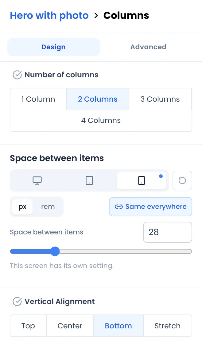
Give each screen a different setting. Size and spacing settings (spacing, gaps, heights, widths, text size, rounded corners) have three small icon tabs (screen, tablet, phone), whose tooltips read Computer, Tablet and Phone.
-
First set the value on the Computer tab, selected by default.
-
Switch to Tablet or Phone. As long as you don’t touch it, the screen follows the computer setting.
-
Change the value: this screen now has its own setting, shown by a blue dot on its tab.
-
To go back to the computer setting, click the circular arrow Use the computer setting.
On the published page, the “phone” display applies up to 767 px wide, “tablet” from 768 to 1,023 px, and “computer” from 1,024 px.
Hide a block on a device. In the block’s Advanced tab, the Visibility per device section offers three buttons, Desktop, Tablet and Mobile. Click a device to hide the block there, click again to show it.
Undo and redo
Section titled “Undo and redo”Use the arrows at the top of the editor, or the keyboard shortcuts:
- Undo: Ctrl + Z (Cmd + Z on Mac).
- Redo: Ctrl + Shift + Z or Ctrl + Y (Cmd + Shift + Z or Cmd + Y on Mac).
The history covers the current editing session. After closing and reopening the editor, earlier changes can no longer be undone one by one.
Preview
Section titled “Preview”The Preview button, at the top of the editor, shows the page full screen as your visitors will see it, with the purchase window. Close the preview with the cross at the top right.
-
Click Close builder.
-
At the bottom of the Page Configuration card, click Save if the page is a draft, or Publish if the Enable White Label Ticketing switch is on.
-
The message “Ticket page saved successfully!” confirms the save.
See also: Ticketing page blocks and Publish and share the page.