
Ticketing page blocks
A ticketing page is a stack of blocks. This page presents each block in the order of the editor’s Blocks tab, with its main settings. To learn how to add and set up a block, see Get started with the editor.
Common settings. Every block has, in its Advanced tab, the Visibility per device section to hide it on desktop, tablet or mobile. Most also have Outer spacing (and often Inner spacing) adjustable per screen, and Rounded corners. Their colours can reuse the page’s theme colours.
The button that sells your tickets
Section titled “The button that sells your tickets”No block displays the list of tickets directly in the page. Sales happen in the purchase window, which opens when someone clicks a Button whose Action is Open ticketing. The buyer sees your tickets on sale, picks quantities, fills in their details and pays. See The checkout.
-
Add a Button block (Images & buttons category).
-
In the Content tab, write the Label, for example “Book your tickets”.
-
Set the Action to Open ticketing. The URL field disappears: this button does not lead anywhere else, it opens the purchase window.
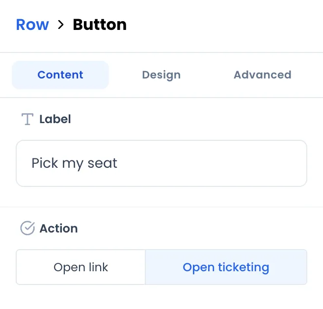
Put at least one button of this kind on your page, otherwise nobody can buy. You can add several: at the top of the page, at the bottom, or in a bar that stays visible on mobile (a Row block set to Always visible at the bottom). The Hero with photo and Call to action band ready-made sections already include one.
The style of the purchase window (colours of ticket cards, fields, pay button…) is set in the page settings. See Colours, fonts and SEO.
Some extensions add their own sales block, for example a seating plan where the buyer picks seats before paying. See Blocks added by extensions.
Ready-made sections
Section titled “Ready-made sections”These blocks are pre-filled Section blocks. They have the same settings as a section, and each element inside (title, text, button…) is edited like a normal block. Their colours follow the page theme.
| Block | What it contains at first |
|---|---|
| Hero with photo | The event image as background, darkened by a shade, with the event name, a tagline and a Book your tickets button that opens ticketing. It takes 70% of the screen height. |
| Practical information | A title and three items with icons: Where, When, Getting there. |
| Questions section | A title and three sample questions and answers. |
| Call to action band | A band in your brand colour with “Ready to join us?”, “Tickets are on sale now.” and a button that opens ticketing. |
Layout
Section titled “Layout”| Block | What it is for | Main settings |
|---|---|---|
| Section | A band of the page grouping other blocks, with a background. | Background image, Background color, Shade color laid over the photo and its strength (0 to 100%), Minimum height (Whole screen, Half screen, Compact), How wide is the content (Narrow (easiest to read), Standard, Wide, Edge to edge), Where the content sits (At the top, In the middle, At the bottom), anchor name (Advanced tab). |
| Columns | Place blocks side by side, over 1 to 4 columns. | Number of columns, Space between items, Vertical Alignment (Top, Center, Bottom, Stretch), Background color. |
| Row | Line blocks up or stack them, and create fixed bars. | Position on the page (Normal (scrolls with the page), Always visible at the top, Always visible at the bottom), Arrange items (Side by side, One above the other), placements, When items no longer fit, Width. |
| Card | A box that holds other blocks. | Background Color, Border Color, Border Width, Width. |
| Icons with text | A list of items with icon, title and description (programme, perks, access). | Items, Number of columns (1 to 4), icon, title and description colours, Icon size (px). |
| Spacing | An empty vertical space. | Height (Small 24 px, Medium 48 px, Large 96 px, up to 400 px). |
| Divider | A horizontal line. | Line color, Width. |
Anchors. Give a section an anchor name, for example tickets, then create an Open link button whose URL is #tickets: clicking it scrolls the page down to that section. The name accepts letters, digits, hyphens and underscores; spaces and accented characters are replaced with hyphens.
Fixed bars. A Row set to Always visible at the top works as a menu; set to Always visible at the bottom, it can carry a buy button. Combined with Visibility per device, you can keep the buy bar for mobile only.
| Block | What it is for | Main settings |
|---|---|---|
| Title | A heading from level H1 to H4. | Preset size (Extra large (H1), Large (H2), Medium (H3), Small (H4)), Alignment, Text color, Text size. |
| Text | A formatted paragraph: bold, italic, lists, links, alignment. | Content, Text size, Alignment (Left, Center, Right, Justified), Text color. |
| Short text | A single line of plain text. | Text, Text size, Font weight (from Thin to Black), Text color. |
| Tags | Up to 4 small pills, for example “Almost sold out” or “18+”. | Type each tag then press Enter; Style, Alignment, Badge color. |
| Questions & answers | An accordion FAQ: clicking a question reveals its answer. | Questions / Answers list (Question, Answer). |
Images & buttons
Section titled “Images & buttons”| Block | What it is for | Main settings |
|---|---|---|
| Image | A photo or a visual. | Image, Alt text, Display mode (Cover or Contain), Focal point (the part of the image that stays visible when it is cropped), Height, border. |
| Button | Open the purchase window or a link. | Label, Action (Open link or Open ticketing), URL, Style (Solid or Subtle), Background color, Width (Auto or Full width (100%)). |
| Video | A YouTube or Vimeo video, or a video file online. | Video URL (YouTube, Vimeo or direct link), Height, Autoplay, Muted, Loop, Controls. |
| Photo gallery | A photo grid; clicking enlarges the photo. | Photos (with a description and a Caption shown under the photo), Photos per row (1 to 4), Photo shape. |
| Countdown | Days, hours, minutes and seconds remaining. | Counts down to (The start of my event, The end of my event or A date I choose), Message shown once the countdown reaches zero, colours, Number size (px). |
| Logo | Your logo, optionally clickable. | Logo image, Alt Text (SEO), Link URL (Optional), Size. |
| Partner logos | A band of logos scrolling continuously. | Logos, Duration (seconds) of one loop (10 to 100), Space between logos. |
| Icon | A single icon. | Select icon (with search), Size (px), Color, Stroke width. |
| Map | A map centred on the event venue. | Address shown under the map, Show a “Get directions” link under the map (opens Google Maps), Map Style (Standard (OSM), Dark Mode, Light Mode), Height, pin latitude and longitude. |
| Social links | Icons for your social networks. | LinkedIn URL, Instagram URL, X (Twitter) URL, Facebook URL, Icon color, Icon size (px). A network without an address is not shown. |
| Language picker | Flags to switch from one language version of the page to another. | Event for each language, Flag size (px), colours. See Offer the page in several languages. |
A few details:
- Button links. An address starting with
#scrolls the page to an anchor, in the same tab. Any other address opens in a new tab, andhttps://is added if you forget it. - Countdown date. With A date I choose, the date is read in UTC. For Paris time, add the offset:
2026-12-31 20:00+01:00in winter,+02:00in summer. With the start or end of the event, the countdown automatically follows the event dates if you change them. - Map pin. The map is placed on the coordinates of the event address at the moment you add the block. Only touch the latitude and longitude if the pin is in the wrong place.
- Starter page. The social links of the starter page point to the networks’ home pages (facebook.com, instagram.com…). Replace them with your own addresses or delete them.
Advanced
Section titled “Advanced”The Custom code block accepts free HTML code (HTML Editor), for layouts the other blocks cannot achieve.
When you save, this code is cleaned: <script> tags, embedded frames (<iframe>), forms, event attributes (onclick…) and id, data-* and aria-* attributes are removed. <style> tags and SVG drawings are kept.
Blocks added by extensions
Section titled “Blocks added by extensions”When you install an extension on the event, its blocks appear under the extension’s name in the last category of the Blocks tab, currently labelled OTHER. Their settings are defined by the extension. Some add an interactive block, such as a seating plan, that opens the purchase window with the visitor’s selection.
These blocks only appear for events where the extension is installed. See Install an extension and The extension catalogue.